Wednesday, December 11, 2013

Texture In Web Design

Smashing Magazine recently released an article discussing the use of texture in web design here. In class we were asked to answer a series of questions regarding the article. 


Why have the benefits of texture sometimes been overlooked?
Texture, in the past, was often over used and used in inappropriate ways. This has “tainted” the use of texture in design today. Many designers feel that texture is not a necessary asset. While it is not always necessary, it can tie a website together and highlight the main focus points in a tasteful way.


What is the usual difference between a texture and a pattern?
A pattern is often a small repeatable element that will tile. A texture is usually much bigger and don’t typically repeat.


What are 2 ways to focus people’s attention using texture?
Texture have the power to highlight certain elements of a site. If a grunge texture is placed against a clean background, the grunge texture will stand out and draw people’s eye. In retrospect, if a clean element is placed on top of a texture, the clean element will draw focus.


How can texture enhance the structure of your information?
Texture enables designers to offset a crucial aspect of a site, or enhance the way information is presented. Specifically, texture can enhance the structure of information. Texture can guide the eye through contrast and imagining lines. This can make content easier to read, find and remember.


How does texture enhance the identity or atmosphere of a site?
Texture can become a trademark to a brand and “...put a face to the service…”. This creates a recognizable brand that has personality and taste.
Describe in your own words what is meant by the following tips:
  1. Maintain Legibility - make sure content is still prevalent
  2. Don’t Beat a Dead Horse - Don’t overuse texture so that it’s distracting
  3. Practice Means Improvement - Experiment with different textures and take risks
  4. If It Serves No Purpose, Take it Out - Make sure the texture serves a justifiable purpose. It should not just “be there”.
  5. Consider the Effect You Are Trying to Achieve - Think about what vibe the texture brings to the table
  6. Collect Resources so you Don’t Have to Search Later - Keep an array of resources for future reference
  7. Learn Masks - Experiment and learn the software
  8. Don’t Sacrifice Quality for Loading Time - A quality texture dominates slow loading time
  9. Choose Textures Logically - Use textures that are relevant to the kind of site being built
What are 3 different ways you can come up with your own texture images?
To come up with texture images from scratch you can use your own photos, scan different materials or experiment in photoshop.

Sites that use texture effectively:
- KEZ

Wednesday, December 4, 2013

Social Media Can Effect Your Future

     The New York Times recently released an article written by Natasha Singer. This article discusses the involvement of a students online image in the college admissions process. The article provides an anecdote of  a young girl who applied to a college in Maine was rejected because she posted derogatory comments about her fellow students on Twitter. This girl is surely not the first to do this, but her story caught the public eye and created much controversy. Now students are left to recall anything they have posted online that could threaten their future.
     My online presence could be somewhat notable through my number of accounts, but not enough to effect me in a significant way. I have a Facebook, Youtube, Tumblr, 8tracks, Twitter, Instagram, and Blogger account, but not much else. None of what I post on any of these sites promotes a negative image for myself. I don't post much on Facebook or Instagram and my Twitter account remains dormant. If anything the most questionable aspect of any of my accounts would be my music taste on 8tracks.    
     I think it is incredibly fair for future employers and schools to research an applicants online presence.  If the student posts something questionable online, it is entirely their own fault. Because of people's poor judgement regarding what is appropriate to post and what is not, schools have resorted to teaching these basic concepts to high school students. It is embarrassing that the disregard for inappropriate status updates, pictures, and @mentions has led to this. 
     What I find particularly perplexing is that all through middle school we were told that whatever we put online is permanent. We were lectured on the use of the "delete button" and how in a few seconds hundreds of people have already seen what we so desperately wanted to delete. Six some years ago it was vital that kids understand a picture or status could be pulled from cyberspace even if they thought it was long gone. Now administrators are teaching kids to "cleanse" their online presence and "sanitize" their digital image. If everything is permanent, how is one supposed to make their digital presence immaculate? 

Thursday, November 7, 2013

KC Redesigns Logo


   Graphic designer Emily Elmore has created much talk, regarding her new logo design for KC. Elmore provided this re-amped logo to the Kansas City government free of charge. Opinions about the logo came pouring in, and most of them were not pleasant. Many people have called the logo a "boring...monogram...". Despite the high criticism that surrounds her logo, Elmore has defended it stating "Any press is good press". 

    Redesigning has recently become a trend and many are leaning towards simplistic, contemporary designs. Elmore pulled from many sources of inspiration to create this new logo. The interlocking K and C reminisce of old sport team logos and the C and H found on the doors at city hall. The seriffed font keeps it somewhat traditional. Although the seriffed font ties the logo with some of Kansas City's past, the bright mint green is what some might call "contemporary". Kansas City is a city that has much depth, and it's logo should do it justice. Officials of Kansas City only see the redesign as an opportunity to bring the city and it's past into the 20th century. 

    I do not like the new logo at all. I don't feel that it embodies the vibe of Kansas City and it is an idea everyone has seen hundreds of times before. The interlocking K and C is an old design that has been around forever. The mint green and grey contrast very nicely, but I don't like them in a logo for Kansas City. The logo is very clean, but clean can also be a synonym for boring. Clean and simplistic design should still be eye catching and original. 


Thursday, October 24, 2013

Dont Make Me Think: Krug Ch.3

Krug Ch.3 Project

This website has lots of background noise. Even though the background is black and white it is still very distracting; the flashing graphics in the corner of the page do not help.Versace 


Google is one of the most well know sites and it is very easy to use. The main page really has only one clear purpose and that is to search something. The basic primary colors and white background eliminate distraction. Google


This website does not clearly indicate what is clickable. It appears that the underlined phrase "WIIFM" is clickable because's its underlined and bolded, it's not. Also because all of the content text is white it becomes hard to decipher what text is information and what are links. Natalie M. Fashion Show


MoMa has a nice site where you know immediately if something is clickable or not. Most of the links have a small red arrow or are in a different type in order to indicate if it is a link or not. MoMA


Pintrest is a site that has awful organization.  Nothing is split up into defined areas so the user must scroll through the site with their eyes "bouncing". This can be very inconvenient if the user is looking for something very specific. Pintrest
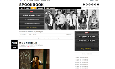
Lookbook is a fashion site that is very well organized. The navigation is incredibly easy and it is very easy to find a desired search. Lookbook allows users to search by clothing item, designer, date, color and country. Lookbook clearly defines where everything is and clearly shows what is offered in its layout.
Lookbook


8tracks is a site that uses conventions very well. They indicate a "+" sign to expand something, house to represent the link home, A triangle to indicate play and numerous others. Conventions with music sites can be especially recognizable. 8tracks


Apple takes a "less is more" approach to their website. This helps clarify a strong visual hierarchy. Apple uses bolded and enlarged text to draw the users eye to it and then gradually move down to the small text. Doing this allows the user to find what they need quickly. Apple


Tuesday, October 22, 2013

Don't Make Me Think!

Don't Make Me Think!

A web page should not require the user to put effort into thinking about something that should be effortless. A web designers job is to eliminate a users "question marks" and make the navigation as easy as possible. The page should not only be self-evident, but self-explanatory.


This website has numerous problems with it. A lot of questions pop into my head when I look at only the homepage. First of all I have no clue where to look first. The four column layout is very distracting as well as the bold type in the boxes, not to mention the crazy amount of color. Another question this site provokes is "What is a link?" The scattered boxes in the four column layout could be links, but there is nothing to indicate they are clickable.  Pinesol


Another site that has many problems with it is the U.S. Versace site. From a design aspect, the background is incredibly busy; even though it is black and white it does not as as a background to the brightly colored boxes in the three column layout. Also many of the links are at the bottom of the page. This is not an issue when browsing, but if someone was looking specifically for something on this site, it would be ideal to have the links at the top of the page to ensure that the user finds what they are looking for quickly. Versace


RVCA's site has awful navigation. It is unclear what any of the linked boxes link to. You much hover over each one to see what the subject matter is. While the design is very clean and organized, it makes it hard to know what is clickable and what is not. RVCA's drop down menu for "shop" is a slightly transparent , textured background. This makes the text very hard to read and the grey font color does not help their case. RVCA


Tuesday, October 15, 2013

My Personality Type


My Personality Type

    My Myers-Briggs personality type is ENFJ.  This is the second least common of personality types. 3% of the population have this personality. People with this personality type are often in tune with the emotion of others and themselves. Those with an ENFJ personality have an idealistic, ambitious way of thinking. It is common that they are looked to as "inspiring leaders". Celebrities with this personality type are Martin Luther King Jr, Peyton Manning, Dick Van Dyke and Johnny Depp. 
 

The description of this personality describes me fairly well. People with an ENFJ personality are optimistic and forward thinking. I always try to find the good in every situation, despite any poor circumstances. I am also very idealistic and my mindset is focused constantly on the future. I find it strange that powerful leaders such as Martin Luther King Jr. share my personality type because sometimes I find it hard to lead. I aspire to be a strong and inspiring leader, but I feel like it's something I can still improve upon. 


People who have an ENFJ personality like to maintain healthy relationships and can become exhausted if they are surrounded by too much negative emotion. This is probably the most accurate description of me. If I am surrounded by too much negative energy I become drained. This prompted me to cut out the toxic influences in my life. People with an ENFJ personality are very, if not overly empathetic. This clarifies why I have such a strong compassion for everything. I feel having an ENFJ personality also explains my love for words. I love how books and songs are written. They way words give us the power to communicate in so many different ways is crazy. It's fascinating how 26 letters in the alphabet have such a power over us. ENFJ personalities typically find communication to be key and use words to connect with others. 

    The Truity website defines a person with an ENFJ personality as a teacher. I find this funny because I intend to become a college english professor. I want to be able to motivate and support people and being a teacher is a great way for me to achieve this. Sometimes it's hard for me to find my voice in a group, but when I do I give 110%. It's extremely important to me that I reach and help others reach their maximum potential. I also find it ironic that Myers-Briggs describe the ENFJ personality as an "inspiring leader" because I am working towards becoming an ambassador for an organization called Team Inspire. 

   People with the ENFJ personality sometimes over exaggerate their words to produce their desired effect. I do this a lot, as hyperboles are a part of my everyday language. This could be confused with wanting attention or ignorance. I am not ignorant I just find that exaggerations are a part of speech I am comfortable with, but I think it has just become habit for me to exaggerate everything. 

   Through discovering I have an ENFJ personality type I have come to the realization that I really do aspire to become a teacher. This personality type explains my compassion and empathetic attitude towards situations and why I have such a concern with reaching my full potential. It also qualifies my idealistic mindset and why I tend to live in the future. 


Friday, September 27, 2013

Design Case Study Summary


    Playground is a digital creative agency located in Canada. The company has been around for 4 years and is continuing to grow and expand. Playground helps their clients broaden the horizon in terms of creativity and innovation. The team at Playground is always looking to add a sense of exuberance to every project they work on and felt their branding should represent that. This year Playground decided to take on the task of rebranding.


An image of the original Playground Inc. logo.
PLAYGROUND LOGO CIRCA 2009


    First they started with the logo. The original logo for playground used a simple sans serif font in a standard shade of grey. The "O" in "Playground" was purple and elevated above the rest of the other letters. Light grey dashes are placed over the "G" and "R" so the "O" is depicted as a ball bouncing. While the logo was very playful and clean the colors made branding very limiting. While purple interprets a slight whimsical vibe, it is a very finite color and Playground desired to do more. The name of the company conceptually ties into Playgrounds approach to everything. The logo needed to represent the dual meaning of work and play. After a great deal of time the creative minds at the company came up with a logo they were very pleased with. The new logo illustrates a deep purple hexagon with rounded edges. Inside the hexagon a white scripted "P" is placed. To the right of the hexagon is "playground inc." is presented as a sans serif type face in black. Many people felt the new logo was a bad combination of the "P" in Pintrest and the hexagon in Simplebits. Eventually Playground realized they needed to push further and find a new, fresh and timeless identity for them to take ownership of.                                     

NEW PLAYGROUND LOGO


    Playground was left with ambition and inspiration from the branding work of Paul Rand and Massimo Vignelli. They took it upon themselves to create a simple, but bold logo that was both geometric and timeless. Playground felt the hexagonal "P" was very geometric and clean while the color red makes the brand appear very approacable. The color red doesn't have as many limits as purple giving the brand a fresh and fast feel. 

The final Playground logo
PLAYGROUND LOGO 2013

   Rebrand sounds like a death sentence yet it can launch a company into many new ares and provide new opportunities. I think that rebranding can either help or hurt a company. This is illustrated with the development of Playground's logo. If you look at Playground's logo from 2009 and then the 2013 one there is a notable difference and feel between the two. More and more companies are rebranding themselves, trying to create a new image for the new age. If anyone should learn anything from rebranding it should be that simplicity is often the better option. Simplicity doesn't mean a boring corporate logo, but something that is fresh and modern. 


Friday, September 20, 2013

Photoshop Logo

   This is a logo I designed in class. It was designed in photoshop with the help of a tutorial. Video tutorials are not something that I'm great at following along to, but the logo looks fine. Last year I started using Illustrator more and didn't focus as much on photoshop. This was defiantly a factor that challenged me with this tutorial. In this tutorial the use of layer masks greatly effected the outcome. 

Friday, September 6, 2013

Douglas C. Engelbart


Douglas C. Engelbart was set on making the world a better place through the technology of computers. He is known for his demonstration known as "The Mother Of All Demos" in 1968. There he demonstrated many technologies, particularly the mouse. His legacy lives on through the inventions he created and through the The Doug Engelbart Institute founded by him and his daughter Christina. He and many other innovative minds pushed through the wall and guided us to where modern technology stands today. 

Tuesday, September 3, 2013

Blogger vs. Google Sites

In contrast to setting up a site in Google Sites, Blogger is much more user friendly. Blogger is easy to use and very customizable, but Blogger is more of a "blog" rather than a "website". Google Sites is good for someone who needs separate pages for different kinds of content. Blogger is good for someone who wants to run a blog where the use of pages comes into play, but posts are overridden by an archive.