Showing posts with label assignment. Show all posts

Friday, April 24, 2015

A Review of Webflow

  Webflow is quite the ideal website builder for those who have a bit of knowledge about designing and code. There is a small learning curve, but after spending an hour or two on the site, navigation becomes almost second nature. Webflows allows its user to start with a completely blank canvas or use a few of of the free templates they offer. A positive about Webflow is that while the main focus is to visually edit a site, there is also the option to focus on its code. It also allows the user to host the site on their own server.


  When creating a website in Webflow, the site takes you to what they call "The Designer". This is where the creation and customization of sites begin. Once of the most glorious features of Webflow is that it automatically makes the site responsive (see #1). The icons at the top of the page allow the user to manipulate the site and see what it looks like on a desktop, tablet or mobile device. Another nice feature of Webflow us that similar to dreamweaver, it tells the user what is being selected (see #2). Knowing what is selected is helpful in that it aids in making sure things being changed are supposed to be changed. Whatever is being selected will have a blue highlight around it and a small blue label in the upper left corner. Again, similar to Dreamweaver, Webflow has a small menu on the bottom left corner that also states what is being selected and edited.

  When in "The Designer" the user has two menus on either side of the screen. The one on the left, is to add divs, text, heading etc to the site (see #3). They are grouped into sub menus such as "basic" "typography" "media" and "forums". The on on the right is to edit whatever has been edited. To add something to the site, simply click on "add element" and drag out to the main part of the site.

  Then head over to the right side and customize it (see #4). Change the padding, height, color, type. Most adjustments can be done manually or just by clicking on the arrows featured on the right side menu. Like the left side, the right side menu is sorted into sub categories like "position" "typography" and background.


Tuesday, March 24, 2015

What The Rising Use of Mobile Users Mean For Web Designers

  Looking at the user stats for our school site, it is apparent that the number of mobile users are increasing. While the majority of users visit on a desktop, the amount of mobile users have continued to increasingly surpass the amount of tablet users. This is probably due to the ease and accessibility to mobile devices. Every time I step out of the house or my car, I make sure I have my phone. Anytime I go to lunch I make sure I have my phone. Right before I go to bed I - yep, check my phone. Last week I went to a restaurant and they even recommended we use our phones to order our food. This is helpful to web designers, as it is now more important to make sure websites are responsive and have mobile friendly navigation.

  An important stat to focus on is how long mobile users stay on the site compared to non-mobile users. The bounce rate for mobile users continues to be the largest, almost 15% from the 2014 stats. In contradiction the amount of time a mobile user spends on the site continues to be the smallest. Compared to desktop users, mobile users stay on the site for almost half the amount of time. This is important for web designers to pay attention to, as mobile users aren't just perusing the site - they are looking for a specific, quick piece of information. This indicted that the mobile, responsive designs of websites must be clean and easy to navigate.

Monday, March 9, 2015

New and Improved

Last week's assignment was to improve and add to our blog. I typically lean towards more minimalist design, but the last layout of my blog was a bit to minimal. I didn't really have any color and my banner didn't reflect my aesthetic. The first change I made was I created a new header. I knew I wanted it to be my own photo, so I had a "mini shoot" when I shot potential photos I could use for a header. I also added some color and enlarged my nav bar.


Other changes I made include adding a background and labeling my posts. Labeling my posts will keep them a bit more organized and easy to find. I was unsure about adding a background, but I think it pairs well with my banner and the feel of my blog. 


The last couple changes I made were adding some code to get my Instagram to show up in my side bar and adding a portfolio link. I had a portfolio link in my nav bar before, but it hadn't been updated for a while. I also updated my bio and photo. 


Monday, January 12, 2015

Gallup Strengths Test

  Last week my entire class took the Gallup StrengthsFinder Test. After we took the test a guest speaker came in to discuss our results.

1 - Intellection
2 - Input
3 - Adaptability
4 - Empathy
5 - Futuristic 

  My first strength is intellection. Gallup states "a mental hum is one of the constants of your life". This is incredibly applicable to me. I am always thinking about something. My mind doesn't stop. I am not the loudest in group conversations, but I am listening. Listening and thinking. Sometimes this can be a downfall, but most of the time I think I see it as a strength. Gallup also states that I see time alone as an opportunity for "musing and reflection". I am quite introspective and my mind is always buzzing about something. 

  My second strength is input. I have always had many interests. Ever since I was little I've gone through "phases". One week I was an expert on the deep sea, the next day I was an expert on Harry Potter. I've always joked that I'm not really good at any one thing, just mediocre at a ton of little things. I tend to collect small bits of useless information, the stuff that is only useful on every other Jeopardy episode or while playing Trivia Crack, but this is kind of the epitome of "Input". Gallup states that collecting a variety of information "acquiring, compelling and filing stuff away...keeps your mind fresh". This would probably explain why I can never seem to delete photos off my phone (what if I need that blurry picture of a smiling dog later?) and why I smiled and nodded sheepishly when the speaker asked if anyone had a never ending music archive.

Adaptability is my third strength. I remember one time my cousin decided to take my sister and I out to eat. We spent a good 30 minutes deciding on what restaurant because the only answer my sister and I could come up with when prompted with "where do you want to eat?" was "I don't care". I'm a pretty go-with-the-flow person. If something is goes awry my thought process is typically 1. *Mildly freaks out* 2. *Realizes that freaking out won't help* 3. *Accepts the issue and convinces self that it is for the better*.  Gallup describes those with adaptability as people who "see [the future] as a place that you create out of the choices that you make right now". 

My fourth strength is empathy. Gallup describes those with empathy as being able to "hear the unvoiced question...anticipate the need". I think that I'm pretty good at picking up the vibe other people are giving off. I can be pretty intuitive and can easily put myself in other people's shoes. I don't always necessarily agree with the other person, but I can see where they're coming from. Seeing situations from other's perspective is a strength that benefits myself and others.

Futuristic is my fifth strength. I think this is strange considering adaptability is also one of my strengths, but it makes sense. Even though I like to take things as they come I'm also always looking to the future. Gallup states "you are a dreamer...the future energizes you". Sometimes it's the little things like getting to wear a new shirt or overnight french toast, but something is always pulling me towards tomorrow. 

Friday, September 26, 2014

Content Management Systems

   A content management system is a web application that ensures the ease of creating and managing a website, for people who are not web designers. Usually a CMS is made up of two parts, the CMA element and CDA. The CMA allows the creator of the site to customize it without having to know how to code HTML. The CDA element takes the information and changes the creator made and keeps it updated. Some of the most widely used CMS programs are Wordpress, Joomla and Drupal. All three of these CMS are free and have great advantages and disadvantages based on skill level.
Screen Shot 2014-09-19 at 1.37.24 PM 
   Wordpress was released by Matt Mullenwegg in 2003 and has by far the most users, due to it's easy installation and choices for customization. As it is the most popular CMS, Wordpress has the most themes and plugins. It can be tailored to create a website or a blog. Wordpress is a highly recommended CMS for beginners. Users of Wordpress are not required to have any skill in coding in PHP and HTML. A giant advantage to Wordpress, is that Wordpress will host sites from it's own server.
Screen Shot 2014-09-19 at 1.37.36 PM

   Drupal was created in 2001 by Dries Buytaert. Like Wordpress, Drupal also offers a large amount of plugins. Out of "The Big Three", Drupal is considered the most technologically advanced and has the most flexible CMS. Users with at least a basic basis of knowledge in HTML, PHP and other programming languages have more control and flexibility considering customization and technicality in Drupal. Due to it versatility, Drupal fits the size and concept of any website.

Screen Shot 2014-09-19 at 1.36.58 PM   Joomla is the largest CMS for commerce and corporate sites. It kind of runs down the middle of Wordpress and Drupal. It does not require the amount of technical skills Drupal has and doesn't have as many themes and plugins as Wordpress, but is still a smooth operating CMS. Joomla makes it the easiest to set up a a social network or an online store. Joomla is the best CMS for those who desire a more powerful CMS than Wordpress, but want something easier to manage than Drupal.


Sources: Website Set Up, Tech Target

Storytelling vs. Reconciliation

   We tend to listen with our fingers in our ears, meaning people only hear what they want to. It is all to easy to dismiss someone's opposing opinion with a simple "you're wrong", but in order to understand anything, we must listen and understand the opposition. Ever since we were little, our teachers and parents have taught us there are always two sides to every story. This valuable lesson plays an important part in workaday life.

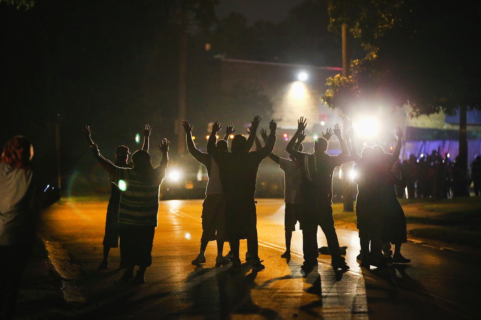
 The death of Michael Brown was a tragic event, as well as the proceeding unrest in Ferguson. The police are still trying to piece together the broken shards of what happened, but it is clear there are two sides. Some say Michael Brown had his hands up and was fleeing Officer Wilson, while others object that Brown was a dangerous, posing threat to the Officer. The media undoubtedly showed bias to one side or another. There were very few reporters and writers that maintained an objective stance on the whole of the situation. This brings about questions surrounding the future of news media outlets. If any of these outlets cease to preserve the smallest bit of objectiveness they have left, who is there left to trust?
   A few weeks ago, my e-Comm teacher told us that he sometimes prefers the BBC website as a news source, rather than sites like CNN or The New York Times. He then went on to say that the BBC often has a more unbiased and objective view than any American news media outlet. Is this what happens when we feel like we can't trust our own news sources? Do other countries find America's stories about their own country, less biased?
   When a story or event blows up globally, it is everywhere. Proof from campaigns like "STOP KONY 2012" show how fast a story can spread, especially if promoted over social media. The video and posters for this campaign spread like wildfire, but after a couple days it became apparent that the "STOP KONY 2012" campaign was not 100% truthful. Despite the "one-sidedness" of stories being spread over social media, their rapid spreading can be an incredible tool if used right. When the revolution and uprising in Syria began, social media became a more useful tool than anything else. The residents, rebels and refugees of Syria used social media expose what was happening — that is before the Syrian government shut them down. Even thought the exposure of the unrest was brief, it was enough to get people's attention and take action.
   Social media has become and incredible tool for situations like those in Syria, but some countries do not have this luxury. China, and some other Asian and Middle Eastern countries do not have access to social media. Twitter, Facebook, Youtube, even Google is blocked. This is not because any of the countries are in a rural area or underdeveloped, but because the government decides what they want the people to see. For America this is a terrifying thought, and makes us wonder what kind of news China is fed. This proves that the levels of "bias-ness" have also flooded into politics.

   While the future of news media outlets is not set in stone, it is certainly headed in the wrong direction if it continues on it's current path.

 Peace in Ferguson - Casey Neistat

Wednesday, September 3, 2014

Index Revision

   In class, we were told to make an index site. This site would act as a page for links to out other projects, blog, etc. When our site was done, we were then told to evaluate each other's site on a scale from 1 to 4. This rating was used to rate its following of CARP and its use of defaults. A critique about my site that stuck out to me was concern about aligning the logo on the left side. They suggested switching the logo and the nav links so the nav bar's logo wouldn't overlap with the banner. I wondered why I hadn't thought of that and changed it immediately. When evaluating other classmates' sites, I didn't want to be harsh, but I wanted to remain truthful. To balance out the negatives of some critiques, I also added in a comment or two about something I liked. I tried to focus on being constructive rather than just stating what I didn't like. I tried to give suggestions and solutions to solve quick fixes.
   The other critique that stuck out to me talked about the "current projects" icons. They said that looked unfinished and unpolished. I really couldn't disagree, as they were unfinished. I wasn't entirely sure what kind of graphics I wanted to make for that section, so I threw together some flat design graphics and hoped it look decent. It was decent, but looked unpolished compared to the top part of the site. Changing them, I sampled colors from the banner and lowered the opacity. I then took the colors and layered them over a graphic of a crumpled piece of paper, for texture. I thought having the white part of the graphic filled in came off as a little heavy so I changed them to be just the outline. Making these changes, gives the site more of a put together and collective look.


Friday, August 29, 2014

Google X Reveals Drone Testing


 News recently broke that Google X (a facility dedicated to technological advancements) have been testing drones as a part of Project Wing. Drones are essentially "flying robot planes" that deliver goods by air. Google X have not been permitted to test on US soil, so the testing has taken place in Queensland Australia. Google X states that the long term purpose of these drones would be to provide immediate relief to people in the event of a natural disaster. The Federal Aviation Administration has kept tight reigns commercial drone use, but is slowly and carefully, looking to change.

   Using drones to provide relief to victims of natural disaster, or residents in rural areas sounds great, but this is not the first thought that comes to mind to most Americans. Most people are excited over the idea of ordering a pizza, or something from Amazon, and receiving it immediately. Amazon has also been extensively working on their own drone delivery service, Amazon Prime Air. Although the potential cost savings and job opportunities would be great, questions about the weather and safety regulation can't help but arise. It will be a few more years before "ship by drone" is the next option after "express shipping", but Google X has been developing and regulating this project for 2 years now. Instead of flying cars, we could have flying drones.

watch the video here

Monday, August 18, 2014

3 Sites, Then and Now

The first image is ebay in 2001. The first distinguishable difference between the old site and the current site, is there is now no side bar. ebay used to be solely an auction site, so a list of categories were crucial. A revised list of categories now resides at the top of the site and in a drop down menu. ebay essentially kept their same color scheme and logo with a few tweaks. The code for ebay has also changed a bit. Shown below, there is a meta tag for key words. Some words have been eliminated, but the sequence of the words have also changed. Orginally "ebay"was the last key word with "auction" being the first. Now it switched around, with "ebay" as the first and auction being the "last".

ebay 2001
ebay 2014
The next site is Twitter in 2006. The layout have significantly changed along with the logo. Twitter is now recognized by just a bird. Also Twitter is now mainly concentrated on as an app. The color scheme has also gone through many shades of blue and now shows no trace of chartreuse.. The homepage of Twitter used to show recent status updates as well. I remember when twitter first came out, I wondered why anyone would join a website based on status updates, now it is one of my most used apps. The code for Twitter used to be heavily based on separate divs, but is more prominent in javascript.
            
Twitter 2014
Twitter 2006

IMDb has continued to keep up with it's usability and layout, but now adding more graphics. Photos and graphics used to take ages to load, but now with faster internet they aren't a problem. The color scheme on the 2014 site has a more polished feel to it then the other one along with a more polished logo. IMDb has relatively kept their same logo, only changing the font and size. In the code, the old site had a lot of usage with tables. almost everything was kept in tables. In the new site, they heavily use iframes, giving users easy access to movie trailers and graphics.
IMDb 2002

IMDb 2014

Using sites like Wayback Machine, or any internet archive, give designers and curious minds alike a look back into the past. Internet archives have become a "yearbook" for graphic and web design. It's interesting and somewhat self satisfying to see how far design has come. It gives a chance to laugh at the earlier stages and compare sites to where they are now.


Wednesday, May 7, 2014

Extreme Homepage Makeover


MVHS 
    Over the past week I have been redesigning the home page of Mountain View High School (shown to the left). I decided to emulate the style of Design Republik's home page as I liked their clean and organized design as well as the color blocking. Mountain View had a nice banner, but the organization of the page was difficult to work with. The home page was essentially gobs of information with no structure. The site also lacked depth, and the gradient, embossed, drop shadow letters were begging to be redesigned. The site was not incredibly horrendous, but it did need to be updated into a more modern, appealing homepage.


Design Republik
  
 Flat design doesn't always work for everything, but I really liked the design of Design Republik. The site has attractive  minimalistic qualities and a user friendly layout (despite that it's in spanish). The color blocking is what caught my eye first and I thought that it would transfer well with  MVHS's red and blue scheme. My only concern with the colors was that the site might end up looking like The Fourth of July.


Logo Redesign
I worked on redesigning the logo first. I was a little unsure how to do a school logo utilizing a flat design esthetic, as most school logos are bold and have a lot of dimension and detail. The new school logo mimics Design Republik's logo quite well. I used the school's original "M" with the torro head in the middle, but added a plain white torro with a drop shadow in a plain black square. I kept the red and blue, but made the colors richer, to add some depth. The thin "Mountain View" offsets the bold "high school" as shown in Design Republik's logo. I decided to place the logo in the footer and in the slideshow photos.


Last Slide of Slideshow
Next I started on the site. I knew that I wanted to keep a slideshow on the front page. I thought this was a nice aspect of the original site. Design Republik also has slide show so I decided to add some graphics to the photos like they had. Finding photos for the slide show was a nightmare. I hoped that Mountain View would simply have a photo album on the site, but they don't. They do however have a separate pages for each school activity within pages of several other pages, and after you weave through that web you might be able to find a low resolution picture after you scroll all the way down (yeah, organization was a real issue). Weaving in and out of the MVHS's website was getting me no where so I took to google. I eventually found enough high quality pictures to use for the slideshow through random news articles they were in. I decided to add in the school's honor code in the slide show as well, which I think looks nice. The slideshow was created using java script.


Redesigned Home Page
The original school site lacked a lot of depth and since I was using a flat design approach to the redesign, I wasn't sure how to add depth. I decided on adding a drop shadow to the entire website container, which helps the page stand out a bit more. I condensed the 3 "blobs" of information they had on the front page into a bar above the footer, mimicking Design Republik's. This condensed the content and made it easer to navigate. I thoroughly enjoyed this project. It made me take a more structured approach to creating a website and mimicking other sites is good practice. 

Path: Taylor, Mallory > MVHS > index


Friday, April 25, 2014

HS Website Redesign

I will be redesigning Mountain View HS, website (and logo) in the style of Design Republik's website.


Tuesday, April 8, 2014

Parallax In Web Design

    Parallax scrolling is a technique used in computer graphics, mainly video games. Parallax scrolling is done by creating background images that move slower than foreground images. This create an illusion of depth and interest. Now this scrolling technique has moved into the world of web design. With web design the effect occurs when various elements on a page move at different speeds. Websites that use parallax scrolling intrigue users and enhance the visual appeal.
    Despite the hype around parallax scrolling, some designers have issues with it. It is arguable the parallax scrolling can take away the functionality of a site or its usability. Since the whole site on one page, the amount of data is a concern too. Users may get tired of waiting for the page to load and hit "x" before they can even see the first heading. 
   Most of the time parallax sites are used for story telling, for informing. A lot of parallax site use symbols and images rather than large chunks of text. A website to enroll you child in school will most likely not have parallax scrolling, but a portfolio might. Adding the element of parallax scrolling is good for catching the user's attention. It creates and element of fun and can be looked a quickly. 
    Most parallax sites are create through a mix of html and javascript or jQuery. These computer programming languages aid in the animation of the scrolling. There are a variety of tutorials and even certain plug-ins that make it easy to create a parallax scrolling site.


Wednesday, January 8, 2014

Alan Turing Receives Royal Pardon After 59 Years


   Alan Turing is a name often associated with the British man who was a mathematical genius, a key in the defeat of the Nazis in World War II. This same man was later chemically castrated for having homosexual relations and poisoned himself 2 years after. 59 years have passed, but in late December 2013 Turing received royal pardon from Queen Elizabeth II. Normally when a royal pardon is given the person at hand is innocent or the family requests it. Turing's conviction was not met with regards to any of these conditions. In July 2012, a bill was proposed to the House of Lords and passed three readings. Before the bill could reach the House of Commons the British Government decided to agree to the petition. Turning was granted pardon for his conviction of gross indecency. This took immediate effect.

   Alan Mathison Turing was born in London at the early start of the 20th century. His intelligence was quite notable and was recognized early on by his instructors. Turing’s focus was solely dedicated to math and science. This created controversy at the school he attended as it focused heavily on the classical studies. Despite this he continued to advance independently with his studies outside of school. Alan Turing relished in the idea that he could solve and grasp complex problems. Since his youth it was obvious Turing thought like a scientist.

   After being educated as a undergraduate at King’s College Turing went on to earn his PhD from Princeton. After Princeton, he returned to Cambridge and began his work with the Government Code and Cypher School. The GC&CS created an extensive cryptanalytic facility that became essential in World War II. Turing was a key code breaker in the cryptanalysis of the Enigma, created by the Axis powers, specifically Germany. He deduced the indicator procedure used by the German navy and created a portable and secure voice scrambler codenamed Delilah. These are a few of many advanced aided by Turing which resulted in the defeat of the German Nazis.

   In 1946 Turing worked with the design of the Automatic Computing Engine (ACE) and even came up with his own revised design. In 1948 Turing was appointed a principal lecturer in the department of mathematics at the University of Manchester. In 1949 he started to work on software for the Manchester Mark 1. This was one of the earliest stored-program computers. During this time Turing began to work in the field of abstract mathematics. He developed his own experiment, which became known as the Turing Test. This experiment tested the issue of artificial intelligence. The Turing test was the idea that if a computer could fool a human into thinking it too was a human, the machine could “think”. A reversed form of this test is used widely online.

   About 3 years later, Turing formed a romantic relationship with a man named Arnold Murray. Through the result of a burglary the police acknowledged that Turing and Murray were romantically together and both men were arrested. At this time homosexuality was against the law. Turing felt no guilt for having a relationship with Murray and pleaded guilty. He agreed to undergo chemical castration as punishment. He was not allowed to continue his job with GC&CS, but was granted his job as an educator. 2 years after Turing was convicted his cleaner found him dead. It has been confirmed that the cause of death was cyanide poisoning. It is suspected he purposefully consumed an apple laced with cyanide in order to end his life.

   Turing has received much recognition for his work breaking the German enigma code and creating new programs. He was a remarkable man whose brilliant mind saved countless lives. The mathematical genius created the basis of modern computing. Not only was he in standing for a well deserved pardon, but he deserves to be remembered and recognized for his immense contribution to science.

Wednesday, December 11, 2013

Texture In Web Design

Smashing Magazine recently released an article discussing the use of texture in web design here. In class we were asked to answer a series of questions regarding the article. 


Why have the benefits of texture sometimes been overlooked?
Texture, in the past, was often over used and used in inappropriate ways. This has “tainted” the use of texture in design today. Many designers feel that texture is not a necessary asset. While it is not always necessary, it can tie a website together and highlight the main focus points in a tasteful way.


What is the usual difference between a texture and a pattern?
A pattern is often a small repeatable element that will tile. A texture is usually much bigger and don’t typically repeat.


What are 2 ways to focus people’s attention using texture?
Texture have the power to highlight certain elements of a site. If a grunge texture is placed against a clean background, the grunge texture will stand out and draw people’s eye. In retrospect, if a clean element is placed on top of a texture, the clean element will draw focus.


How can texture enhance the structure of your information?
Texture enables designers to offset a crucial aspect of a site, or enhance the way information is presented. Specifically, texture can enhance the structure of information. Texture can guide the eye through contrast and imagining lines. This can make content easier to read, find and remember.


How does texture enhance the identity or atmosphere of a site?
Texture can become a trademark to a brand and “...put a face to the service…”. This creates a recognizable brand that has personality and taste.
Describe in your own words what is meant by the following tips:
  1. Maintain Legibility - make sure content is still prevalent
  2. Don’t Beat a Dead Horse - Don’t overuse texture so that it’s distracting
  3. Practice Means Improvement - Experiment with different textures and take risks
  4. If It Serves No Purpose, Take it Out - Make sure the texture serves a justifiable purpose. It should not just “be there”.
  5. Consider the Effect You Are Trying to Achieve - Think about what vibe the texture brings to the table
  6. Collect Resources so you Don’t Have to Search Later - Keep an array of resources for future reference
  7. Learn Masks - Experiment and learn the software
  8. Don’t Sacrifice Quality for Loading Time - A quality texture dominates slow loading time
  9. Choose Textures Logically - Use textures that are relevant to the kind of site being built
What are 3 different ways you can come up with your own texture images?
To come up with texture images from scratch you can use your own photos, scan different materials or experiment in photoshop.

Sites that use texture effectively:
- KEZ

Wednesday, December 4, 2013

Social Media Can Effect Your Future

     The New York Times recently released an article written by Natasha Singer. This article discusses the involvement of a students online image in the college admissions process. The article provides an anecdote of  a young girl who applied to a college in Maine was rejected because she posted derogatory comments about her fellow students on Twitter. This girl is surely not the first to do this, but her story caught the public eye and created much controversy. Now students are left to recall anything they have posted online that could threaten their future.
     My online presence could be somewhat notable through my number of accounts, but not enough to effect me in a significant way. I have a Facebook, Youtube, Tumblr, 8tracks, Twitter, Instagram, and Blogger account, but not much else. None of what I post on any of these sites promotes a negative image for myself. I don't post much on Facebook or Instagram and my Twitter account remains dormant. If anything the most questionable aspect of any of my accounts would be my music taste on 8tracks.    
     I think it is incredibly fair for future employers and schools to research an applicants online presence.  If the student posts something questionable online, it is entirely their own fault. Because of people's poor judgement regarding what is appropriate to post and what is not, schools have resorted to teaching these basic concepts to high school students. It is embarrassing that the disregard for inappropriate status updates, pictures, and @mentions has led to this. 
     What I find particularly perplexing is that all through middle school we were told that whatever we put online is permanent. We were lectured on the use of the "delete button" and how in a few seconds hundreds of people have already seen what we so desperately wanted to delete. Six some years ago it was vital that kids understand a picture or status could be pulled from cyberspace even if they thought it was long gone. Now administrators are teaching kids to "cleanse" their online presence and "sanitize" their digital image. If everything is permanent, how is one supposed to make their digital presence immaculate? 

Thursday, November 7, 2013

KC Redesigns Logo


   Graphic designer Emily Elmore has created much talk, regarding her new logo design for KC. Elmore provided this re-amped logo to the Kansas City government free of charge. Opinions about the logo came pouring in, and most of them were not pleasant. Many people have called the logo a "boring...monogram...". Despite the high criticism that surrounds her logo, Elmore has defended it stating "Any press is good press". 

    Redesigning has recently become a trend and many are leaning towards simplistic, contemporary designs. Elmore pulled from many sources of inspiration to create this new logo. The interlocking K and C reminisce of old sport team logos and the C and H found on the doors at city hall. The seriffed font keeps it somewhat traditional. Although the seriffed font ties the logo with some of Kansas City's past, the bright mint green is what some might call "contemporary". Kansas City is a city that has much depth, and it's logo should do it justice. Officials of Kansas City only see the redesign as an opportunity to bring the city and it's past into the 20th century. 

    I do not like the new logo at all. I don't feel that it embodies the vibe of Kansas City and it is an idea everyone has seen hundreds of times before. The interlocking K and C is an old design that has been around forever. The mint green and grey contrast very nicely, but I don't like them in a logo for Kansas City. The logo is very clean, but clean can also be a synonym for boring. Clean and simplistic design should still be eye catching and original. 


Thursday, October 24, 2013

Dont Make Me Think: Krug Ch.3

Krug Ch.3 Project

This website has lots of background noise. Even though the background is black and white it is still very distracting; the flashing graphics in the corner of the page do not help.Versace 


Google is one of the most well know sites and it is very easy to use. The main page really has only one clear purpose and that is to search something. The basic primary colors and white background eliminate distraction. Google


This website does not clearly indicate what is clickable. It appears that the underlined phrase "WIIFM" is clickable because's its underlined and bolded, it's not. Also because all of the content text is white it becomes hard to decipher what text is information and what are links. Natalie M. Fashion Show


MoMa has a nice site where you know immediately if something is clickable or not. Most of the links have a small red arrow or are in a different type in order to indicate if it is a link or not. MoMA


Pintrest is a site that has awful organization.  Nothing is split up into defined areas so the user must scroll through the site with their eyes "bouncing". This can be very inconvenient if the user is looking for something very specific. Pintrest
Lookbook is a fashion site that is very well organized. The navigation is incredibly easy and it is very easy to find a desired search. Lookbook allows users to search by clothing item, designer, date, color and country. Lookbook clearly defines where everything is and clearly shows what is offered in its layout.
Lookbook


8tracks is a site that uses conventions very well. They indicate a "+" sign to expand something, house to represent the link home, A triangle to indicate play and numerous others. Conventions with music sites can be especially recognizable. 8tracks


Apple takes a "less is more" approach to their website. This helps clarify a strong visual hierarchy. Apple uses bolded and enlarged text to draw the users eye to it and then gradually move down to the small text. Doing this allows the user to find what they need quickly. Apple