Krug Ch.3 Project
This website has lots of background noise. Even though the background is black and white it is still very distracting; the flashing graphics in the corner of the page do not help.Versace
Google is one of the most well know sites and it is very easy to use. The main page really has only one clear purpose and that is to search something. The basic primary colors and white background eliminate distraction. Google
This website does not clearly indicate what is clickable. It appears that the underlined phrase "WIIFM" is clickable because's its underlined and bolded, it's not. Also because all of the content text is white it becomes hard to decipher what text is information and what are links. Natalie M. Fashion Show
MoMa has a nice site where you know immediately if something is clickable or not. Most of the links have a small red arrow or are in a different type in order to indicate if it is a link or not. MoMA
Pintrest is a site that has awful organization. Nothing is split up into defined areas so the user must scroll through the site with their eyes "bouncing". This can be very inconvenient if the user is looking for something very specific. Pintrest
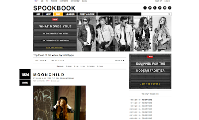
Lookbook is a fashion site that is very well organized. The navigation is incredibly easy and it is very easy to find a desired search. Lookbook allows users to search by clothing item, designer, date, color and country. Lookbook clearly defines where everything is and clearly shows what is offered in its layout.
Lookbook
8tracks is a site that uses conventions very well. They indicate a "+" sign to expand something, house to represent the link home, A triangle to indicate play and numerous others. Conventions with music sites can be especially recognizable. 8tracks
Apple takes a "less is more" approach to their website. This helps clarify a strong visual hierarchy. Apple uses bolded and enlarged text to draw the users eye to it and then gradually move down to the small text. Doing this allows the user to find what they need quickly. Apple


