Friday, September 26, 2014

Content Management Systems

   A content management system is a web application that ensures the ease of creating and managing a website, for people who are not web designers. Usually a CMS is made up of two parts, the CMA element and CDA. The CMA allows the creator of the site to customize it without having to know how to code HTML. The CDA element takes the information and changes the creator made and keeps it updated. Some of the most widely used CMS programs are Wordpress, Joomla and Drupal. All three of these CMS are free and have great advantages and disadvantages based on skill level.
Screen Shot 2014-09-19 at 1.37.24 PM 
   Wordpress was released by Matt Mullenwegg in 2003 and has by far the most users, due to it's easy installation and choices for customization. As it is the most popular CMS, Wordpress has the most themes and plugins. It can be tailored to create a website or a blog. Wordpress is a highly recommended CMS for beginners. Users of Wordpress are not required to have any skill in coding in PHP and HTML. A giant advantage to Wordpress, is that Wordpress will host sites from it's own server.
Screen Shot 2014-09-19 at 1.37.36 PM

   Drupal was created in 2001 by Dries Buytaert. Like Wordpress, Drupal also offers a large amount of plugins. Out of "The Big Three", Drupal is considered the most technologically advanced and has the most flexible CMS. Users with at least a basic basis of knowledge in HTML, PHP and other programming languages have more control and flexibility considering customization and technicality in Drupal. Due to it versatility, Drupal fits the size and concept of any website.

Screen Shot 2014-09-19 at 1.36.58 PM   Joomla is the largest CMS for commerce and corporate sites. It kind of runs down the middle of Wordpress and Drupal. It does not require the amount of technical skills Drupal has and doesn't have as many themes and plugins as Wordpress, but is still a smooth operating CMS. Joomla makes it the easiest to set up a a social network or an online store. Joomla is the best CMS for those who desire a more powerful CMS than Wordpress, but want something easier to manage than Drupal.


Sources: Website Set Up, Tech Target

Storytelling vs. Reconciliation

   We tend to listen with our fingers in our ears, meaning people only hear what they want to. It is all to easy to dismiss someone's opposing opinion with a simple "you're wrong", but in order to understand anything, we must listen and understand the opposition. Ever since we were little, our teachers and parents have taught us there are always two sides to every story. This valuable lesson plays an important part in workaday life.

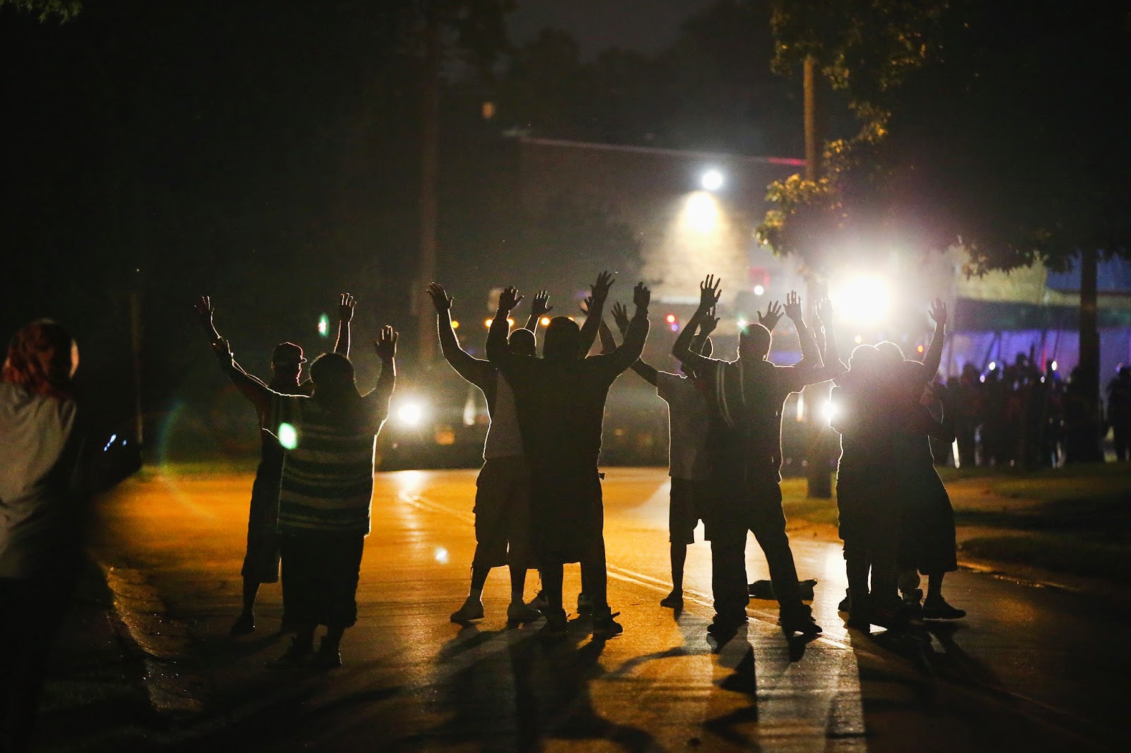
 The death of Michael Brown was a tragic event, as well as the proceeding unrest in Ferguson. The police are still trying to piece together the broken shards of what happened, but it is clear there are two sides. Some say Michael Brown had his hands up and was fleeing Officer Wilson, while others object that Brown was a dangerous, posing threat to the Officer. The media undoubtedly showed bias to one side or another. There were very few reporters and writers that maintained an objective stance on the whole of the situation. This brings about questions surrounding the future of news media outlets. If any of these outlets cease to preserve the smallest bit of objectiveness they have left, who is there left to trust?
   A few weeks ago, my e-Comm teacher told us that he sometimes prefers the BBC website as a news source, rather than sites like CNN or The New York Times. He then went on to say that the BBC often has a more unbiased and objective view than any American news media outlet. Is this what happens when we feel like we can't trust our own news sources? Do other countries find America's stories about their own country, less biased?
   When a story or event blows up globally, it is everywhere. Proof from campaigns like "STOP KONY 2012" show how fast a story can spread, especially if promoted over social media. The video and posters for this campaign spread like wildfire, but after a couple days it became apparent that the "STOP KONY 2012" campaign was not 100% truthful. Despite the "one-sidedness" of stories being spread over social media, their rapid spreading can be an incredible tool if used right. When the revolution and uprising in Syria began, social media became a more useful tool than anything else. The residents, rebels and refugees of Syria used social media expose what was happening — that is before the Syrian government shut them down. Even thought the exposure of the unrest was brief, it was enough to get people's attention and take action.
   Social media has become and incredible tool for situations like those in Syria, but some countries do not have this luxury. China, and some other Asian and Middle Eastern countries do not have access to social media. Twitter, Facebook, Youtube, even Google is blocked. This is not because any of the countries are in a rural area or underdeveloped, but because the government decides what they want the people to see. For America this is a terrifying thought, and makes us wonder what kind of news China is fed. This proves that the levels of "bias-ness" have also flooded into politics.

   While the future of news media outlets is not set in stone, it is certainly headed in the wrong direction if it continues on it's current path.

 Peace in Ferguson - Casey Neistat

Wednesday, September 3, 2014

Index Revision

   In class, we were told to make an index site. This site would act as a page for links to out other projects, blog, etc. When our site was done, we were then told to evaluate each other's site on a scale from 1 to 4. This rating was used to rate its following of CARP and its use of defaults. A critique about my site that stuck out to me was concern about aligning the logo on the left side. They suggested switching the logo and the nav links so the nav bar's logo wouldn't overlap with the banner. I wondered why I hadn't thought of that and changed it immediately. When evaluating other classmates' sites, I didn't want to be harsh, but I wanted to remain truthful. To balance out the negatives of some critiques, I also added in a comment or two about something I liked. I tried to focus on being constructive rather than just stating what I didn't like. I tried to give suggestions and solutions to solve quick fixes.
   The other critique that stuck out to me talked about the "current projects" icons. They said that looked unfinished and unpolished. I really couldn't disagree, as they were unfinished. I wasn't entirely sure what kind of graphics I wanted to make for that section, so I threw together some flat design graphics and hoped it look decent. It was decent, but looked unpolished compared to the top part of the site. Changing them, I sampled colors from the banner and lowered the opacity. I then took the colors and layered them over a graphic of a crumpled piece of paper, for texture. I thought having the white part of the graphic filled in came off as a little heavy so I changed them to be just the outline. Making these changes, gives the site more of a put together and collective look.


Friday, August 29, 2014

Google X Reveals Drone Testing


 News recently broke that Google X (a facility dedicated to technological advancements) have been testing drones as a part of Project Wing. Drones are essentially "flying robot planes" that deliver goods by air. Google X have not been permitted to test on US soil, so the testing has taken place in Queensland Australia. Google X states that the long term purpose of these drones would be to provide immediate relief to people in the event of a natural disaster. The Federal Aviation Administration has kept tight reigns commercial drone use, but is slowly and carefully, looking to change.

   Using drones to provide relief to victims of natural disaster, or residents in rural areas sounds great, but this is not the first thought that comes to mind to most Americans. Most people are excited over the idea of ordering a pizza, or something from Amazon, and receiving it immediately. Amazon has also been extensively working on their own drone delivery service, Amazon Prime Air. Although the potential cost savings and job opportunities would be great, questions about the weather and safety regulation can't help but arise. It will be a few more years before "ship by drone" is the next option after "express shipping", but Google X has been developing and regulating this project for 2 years now. Instead of flying cars, we could have flying drones.

watch the video here

Monday, August 18, 2014

3 Sites, Then and Now

The first image is ebay in 2001. The first distinguishable difference between the old site and the current site, is there is now no side bar. ebay used to be solely an auction site, so a list of categories were crucial. A revised list of categories now resides at the top of the site and in a drop down menu. ebay essentially kept their same color scheme and logo with a few tweaks. The code for ebay has also changed a bit. Shown below, there is a meta tag for key words. Some words have been eliminated, but the sequence of the words have also changed. Orginally "ebay"was the last key word with "auction" being the first. Now it switched around, with "ebay" as the first and auction being the "last".

ebay 2001
ebay 2014
The next site is Twitter in 2006. The layout have significantly changed along with the logo. Twitter is now recognized by just a bird. Also Twitter is now mainly concentrated on as an app. The color scheme has also gone through many shades of blue and now shows no trace of chartreuse.. The homepage of Twitter used to show recent status updates as well. I remember when twitter first came out, I wondered why anyone would join a website based on status updates, now it is one of my most used apps. The code for Twitter used to be heavily based on separate divs, but is more prominent in javascript.
            
Twitter 2014
Twitter 2006

IMDb has continued to keep up with it's usability and layout, but now adding more graphics. Photos and graphics used to take ages to load, but now with faster internet they aren't a problem. The color scheme on the 2014 site has a more polished feel to it then the other one along with a more polished logo. IMDb has relatively kept their same logo, only changing the font and size. In the code, the old site had a lot of usage with tables. almost everything was kept in tables. In the new site, they heavily use iframes, giving users easy access to movie trailers and graphics.
IMDb 2002

IMDb 2014

Using sites like Wayback Machine, or any internet archive, give designers and curious minds alike a look back into the past. Internet archives have become a "yearbook" for graphic and web design. It's interesting and somewhat self satisfying to see how far design has come. It gives a chance to laugh at the earlier stages and compare sites to where they are now.


Wednesday, May 7, 2014

Extreme Homepage Makeover


MVHS 
    Over the past week I have been redesigning the home page of Mountain View High School (shown to the left). I decided to emulate the style of Design Republik's home page as I liked their clean and organized design as well as the color blocking. Mountain View had a nice banner, but the organization of the page was difficult to work with. The home page was essentially gobs of information with no structure. The site also lacked depth, and the gradient, embossed, drop shadow letters were begging to be redesigned. The site was not incredibly horrendous, but it did need to be updated into a more modern, appealing homepage.


Design Republik
  
 Flat design doesn't always work for everything, but I really liked the design of Design Republik. The site has attractive  minimalistic qualities and a user friendly layout (despite that it's in spanish). The color blocking is what caught my eye first and I thought that it would transfer well with  MVHS's red and blue scheme. My only concern with the colors was that the site might end up looking like The Fourth of July.


Logo Redesign
I worked on redesigning the logo first. I was a little unsure how to do a school logo utilizing a flat design esthetic, as most school logos are bold and have a lot of dimension and detail. The new school logo mimics Design Republik's logo quite well. I used the school's original "M" with the torro head in the middle, but added a plain white torro with a drop shadow in a plain black square. I kept the red and blue, but made the colors richer, to add some depth. The thin "Mountain View" offsets the bold "high school" as shown in Design Republik's logo. I decided to place the logo in the footer and in the slideshow photos.


Last Slide of Slideshow
Next I started on the site. I knew that I wanted to keep a slideshow on the front page. I thought this was a nice aspect of the original site. Design Republik also has slide show so I decided to add some graphics to the photos like they had. Finding photos for the slide show was a nightmare. I hoped that Mountain View would simply have a photo album on the site, but they don't. They do however have a separate pages for each school activity within pages of several other pages, and after you weave through that web you might be able to find a low resolution picture after you scroll all the way down (yeah, organization was a real issue). Weaving in and out of the MVHS's website was getting me no where so I took to google. I eventually found enough high quality pictures to use for the slideshow through random news articles they were in. I decided to add in the school's honor code in the slide show as well, which I think looks nice. The slideshow was created using java script.


Redesigned Home Page
The original school site lacked a lot of depth and since I was using a flat design approach to the redesign, I wasn't sure how to add depth. I decided on adding a drop shadow to the entire website container, which helps the page stand out a bit more. I condensed the 3 "blobs" of information they had on the front page into a bar above the footer, mimicking Design Republik's. This condensed the content and made it easer to navigate. I thoroughly enjoyed this project. It made me take a more structured approach to creating a website and mimicking other sites is good practice. 

Path: Taylor, Mallory > MVHS > index


Friday, April 25, 2014

HS Website Redesign

I will be redesigning Mountain View HS, website (and logo) in the style of Design Republik's website.